Course Overview
Level: Beginner to Intermediate
Prerequisites: Basic understanding of HTML structure
Goal: Master web styling, layout design systems, responsive design frameworks, and modern CSS architecture best practices.
Module 1: Introduction to CSS and Foundations
The Role of CSS: How CSS styles the HTML skeleton and communicates with the browser.
Applying CSS to HTML: Exploring inline styles, internal style tags, and external stylesheets using the link tag.
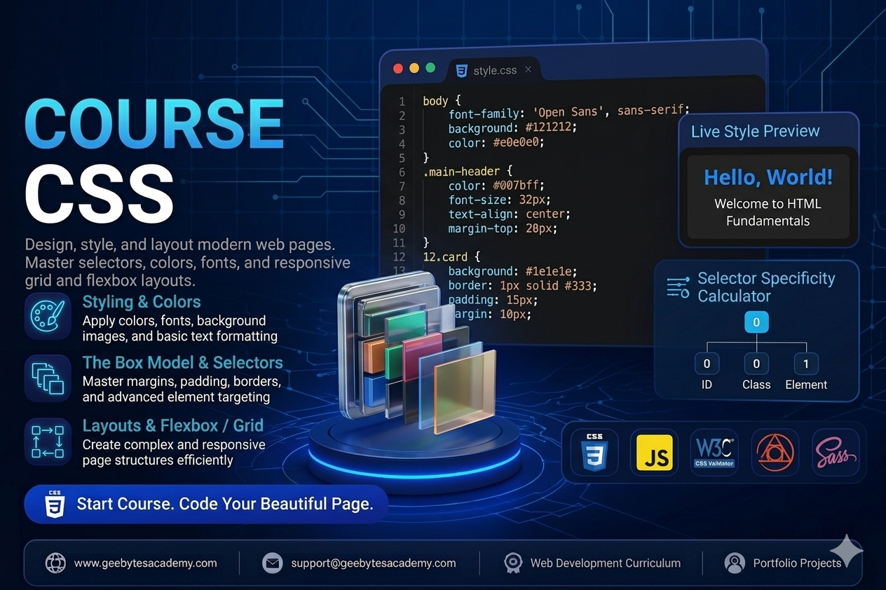
Syntax Anatomy: Understanding selectors, properties, values, and declaration blocks.
The Cascading Rule and Inheritance: Managing how styles flow down to child elements and resolving styling conflicts.
Selector Specificity: Mastering how browsers calculate style priority using IDs, classes, and elements.
Module 2: Basic Styling, Colors, and Typography
Working with Colors: Implementing color values via Keywords, Hexadecimal, RGB, and HSL values.
Typography Essentials: Managing font-family, web-safe fonts, importing Google Fonts, font-size, font-weight, and line-height.
Text Alignment and Formatting: Using text-align, text-transform, text-decoration, and letter-spacing.
Sizing Units Explained: Differentiating between absolute units like pixels and relative units like em, rem, percentages, vw, and vh.
Module 3: Mastering the CSS Box Model
Understanding the Box Model: Total element size calculation using content, padding, border, and margin.
Border Mechanics: Adjusting border-width, border-style, border-color, and creating rounded corners with border-radius.
Margin and Padding Control: Preventing margin collapse and understanding spacing layouts.
The Box Sizing Property: Why box-sizing: border-box is essential for predictable and responsive layout math.
Module 4: Advanced Selectors and State Management
Combinators: Targeting elements using Descendant, Child, Adjacent Sibling, and General Sibling selectors.
Pseudo-classes: Creating interactive states using hover, focus, active, visited, and nth-child for dynamic lists.
Pseudo-elements: Injecting decorative elements or styling specific parts of elements using before, after, first-letter, and first-line.
Module 5: Layout Architecture Part 1 - Flexbox
Introduction to Flexbox: Moving away from floats to a modern one-dimensional layout model.
Flex Container Properties: Aligning and arranging items with display: flex, flex-direction, flex-wrap, and the gap property.
Alignment and Justification: Distributing empty space smoothly using justify-content, align-items, and align-content.
Flex Item Dynamics: Controlling individual element behavior using flex-grow, flex-shrink, flex-basis, and align-self.
Module 6: Layout Architecture Part 2 - CSS Grid
Introduction to CSS Grid: Building two-dimensional layouts with rows and columns simultaneously.
Defining Grid Structures: Using grid-template-columns, grid-template-rows, and the fractional fr unit.
Explicit vs Implicit Grids: Leveraging repeat, minmax, auto-fill, and auto-fit for dynamic grid sizing.
Grid Positioning: Placing items precisely using grid-column, grid-row, and grid-area template layouts.
Module 7: Responsive Web Design and Media Queries
Mobile-First Design Philosophy: Designing for smaller screens first to optimize performance.
Media Queries Mechanics: Writing media rules targeting specific breakpoints using min-width and max-width.
Responsive Images and Viewports: Ensuring media elements scale beautifully across desktop, tablet, and mobile devices.
Module 8: Transitions, Animations, and Effects
CSS Transitions: Creating smooth state changes with transition-property, transition-duration, and transition-timing-function.
CSS Keyframe Animations: Designing custom multi-step animations using keyframes, animation-name, duration, iteration-count, and direction.
Visual Effects: Enhancing UI depth using box-shadow, text-shadow, opacity, and gradients.
Capstone Portfolio Projects
To graduate from this course, students will build two real-world, styled projects demonstrating layout and design mastery:
Project 1: A Fully Responsive Modern Landing Page Layout
Students will build a multi-section landing page using a mobile-first approach. The project requires a sticky navigation bar, a flexbox-based hero section, a clean grid-based feature section, custom hover transitions, and a contact footer. No CSS frameworks are allowed, ensuring pure CSS architecture layout mastery.
Project 2: An Interactive Dashboard UI with Dark Mode Toggle
Students will style a complex user dashboard displaying tables, grid cards, and data summaries. This project focuses heavily on advanced selector tracking, CSS custom variables properties for theme switching, structural alignment, and subtle CSS micro-animations for interactive buttons and states.